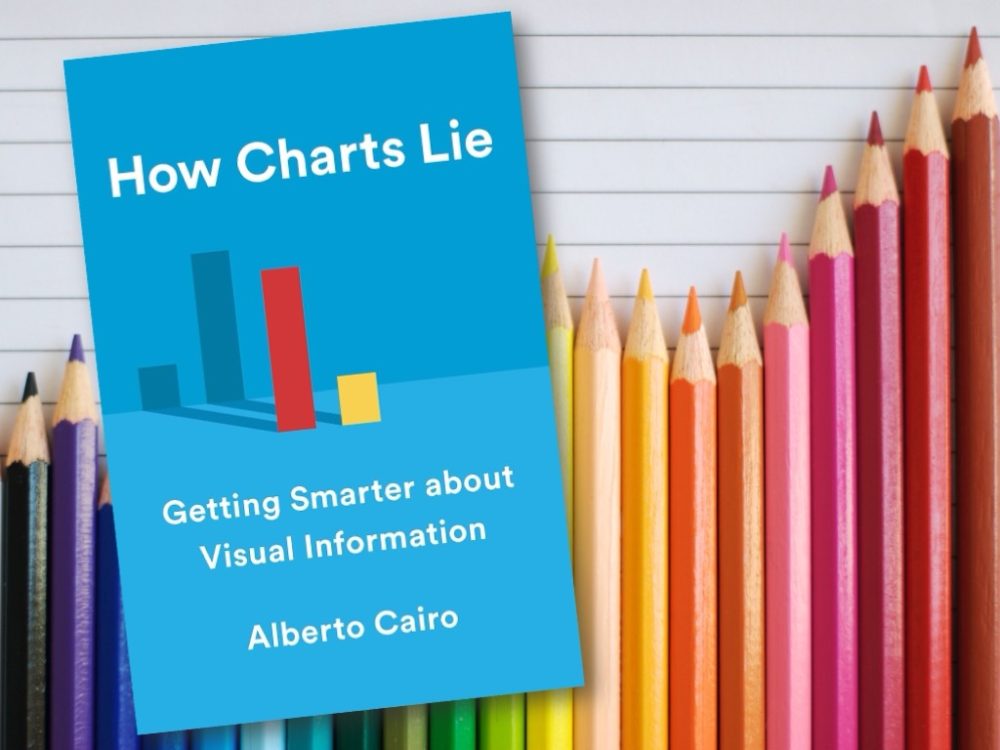
This book aims to educate readers on how to interpret and use charts effectively. Cairo, a data visualization expert and professor at the University of Miami, argues that charts are powerful tools for communication, but they can also mislead, confuse, or manipulate us if we are not careful. He shows us how to avoid common pitfalls and errors when reading and creating charts, and how to develop a critical and informed eye for visual information.
The book is divided into six chapters, each focusing on a different aspect or challenge of charts, such as how they work, how they can be poorly designed, how they can display dubious or insufficient data, how they can conceal or confuse information, and how they can suggest misleading patterns. Cairo uses a variety of examples from politics, business, science, and media to illustrate his points and to demonstrate the dos and don’ts of charts. He also provides practical tips for readers to test their understanding and improve their skills.
The book is well-written, engaging, and accessible. Cairo writes with clarity, humor, and authority, and he explains complex concepts and techniques in simple and understandable terms. He also encourages readers to question and challenge their own assumptions and biases, and to be aware of the ethical and social implications of charts. He does not claim to have all the answers, but rather invites readers to join him in a journey of discovery and learning.
Overall, ‘How Charts Lie: Getting Smarter about Visual Information‘ is a valuable and insightful book that offers a new perspective and approach to charts. It is a must-read for anyone who wants to understand and communicate with charts better, whether as consumers or producers of visual information. It is also a useful resource for anyone who wants to learn more about the science and art of data visualization and how it affects our lives and society.
#HowChartsLie #DataViz #ChartSmart #VisualInformation #DataLiteracy #CriticalThinking #AlbertoCairo #BookReview


